

JJ’s FLOWERS
JJ’s FLOWERS
Reshaping the way people shop and buy flowers
Welcome to the reimagined JJ's Flowers website, where purchasing flowers online is transformed into an enjoyable experience! Our fresh design seamless user navigation with vibrant visuals, ensuring every visit is both engaging and memorable. Explore our captivating layout that not only showcases our beautiful blooms but also enhances your shopping journey. Join us in celebrating the joy of flowers like never before!
E- commerce website Re-design
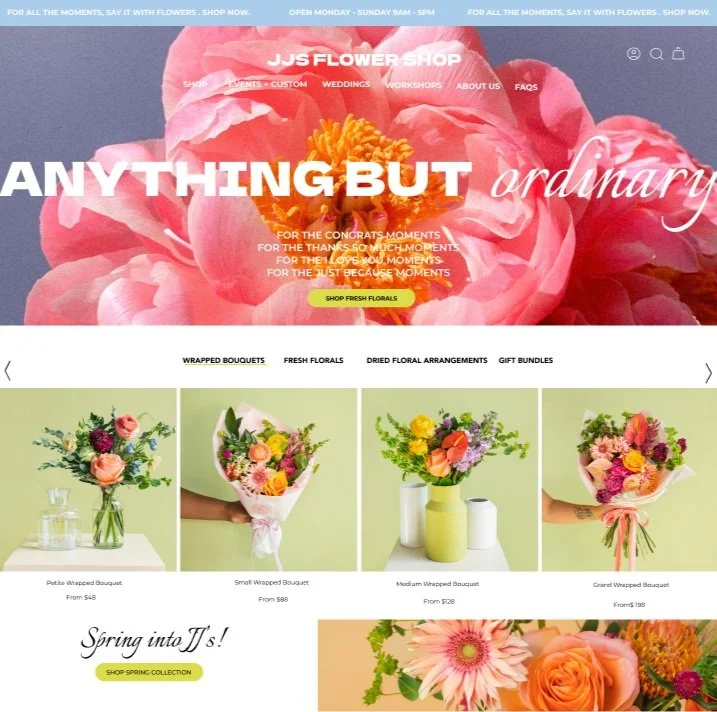
HIFI website homepage

About Us Page

HIFI Drop Down Menu

Flower Arrangement Homepage

Drop Down Menu

Drop Down in stock selection

Drop Down Color Selection

Color Selection Page

Flower selection page

Add to Cart

HIFI View Cart

HIFI Select Pickup or Delivery

Choose Delivery Date

HIFI Choose Delivery Type & Date Page

HIFI Confirm Delivery Date & Time

HIFI Payment Page Blank

HIFI Order Checkout Page

HIFI Confirmation Page

Problem & HMW Statement

User Persona

Journey Map

User Interview Objective

User Interview Questions

Usability Testing on Original Site

Affinity Mapping results

User Flow Results
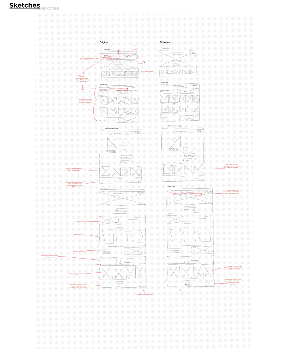
Wireflow sketches

C & C Analysis of JJ's & 3 Competitors

Tree Test Results

JJ's Flowers Style Guide

MIFI Wireflow

HiFI wireflow

Usability Testing Data Redesigned Website
JJ’s Flowers: CAse study
Tagline: Flowers and Feelings, En MASSE
The Basics | Easy to Scan Details
Company: JJ’s Flowers
Device + Project Type: E- Commerce Website ReDesign
User + Audience: Mostly women ages 28-60
Role + Responsibilities:
Conduct user research and interviews
Create wireframe sketches
Test multiple design solutions
Develop user personas
Create low and high-fidelity wireframes and prototypes
Solo or Group Project? Solo
Duration: 3 weeks
Tools & Methods Used: User flow charts
User personas
Tree testing
Customer journey maps
Affinity mapping
Low-fidelity wireframing sketches
Qualitative interviews
Usability testing of the low-fidelity prototype
Tools used: Figma, FigJam
Click the link above ⬆️
Prototype instructions :
Navigating through this re-imagined website, You are shopping for a friend who likes whimsical flower arrangements in the colors of pink and purple. You have to send the flower arrangement on the day of the 29th of February.
Your instruction is to find the about me page to learn more about the company and owner, identify the hours of operation. Navigate back to the home page. Utilize the facet(filter) to select the colors that you would like to purchase. Find the flower arrangement with the most whimsical name ( Watermelon Sugar), schedule the pickup date and complete the checkout process.
The Design Solution
Through my ideation process, I improved the website’s navigation, filtering options, store information visibility, and upselling opportunities. The goal was to make the site more user-friendly and help customers complete their purchases effortlessly.
Key Insights That Informed the Design:
📌Users struggled to find essential store details (hours, location, delivery options).
📌The primary navigation was unclear.
📌There was an opportunity to increase revenue through add-ons (e.g., chocolates, balloons, or vases).
Additional Constraints
📌Limited delivery range: The company only delivers within metro Atlanta, reducing the potential customer base.
📌Purpose: The redesign aimed to enhance the online shopping experience and drive business growth.
Outcome & Results
By analyzing user behavior, I redesigned the website to be more intuitive and efficient. Success was measured by:
Improved usability based on testing results
Users easily locating store hours and delivery/pickup options
Enhanced filtering for quicker product selection
Encouraging upselling through add-ons
Overview | What’s the Main Storyline?
This project aimed to understand how users think when shopping for flowers online. The goal was to improve the shopping experience by making navigation smoother, increasing visibility for key business information (such as hours of operation), and optimizing the site’s functionality to encourage more sales.The Main Challenge!
How might we:
How might we improve navigation and visibility through out the website?
How might we improve the filter option to help the user find flowers based on color?
Main Challenge
The biggest challenge was maintaining the fun and vibrant brand identity while working within the owner's strict design limitations.

Section 1 | Research Phase
What Did You Do?
Conducted 4 user interviews to understand how users shop for flowers online.
Identified pain points during the shopping experience.
Conducted competitor analysis to evaluate how similar businesses structure their online stores.
Used tree testing to observe how users navigate site sections.
Methods USED :
User Interviews → Helped uncover customer frustrations and expectations.
User Flows → Allowed me to analyze how users navigate the website.
Usability Testing → Helped identify real-time issues with the previous website.
Competitive & Comparative Analysis → Provided insights into industry standards for e-commerce flower shops.
Tree Testing → Revealed navigation challenges.
Results:
Users struggled with site navigation and finding store hours.
Many wanted a streamlined checkout process.
There was interest in upselling add-ons, but users found it hard to discover these options.
Takeaways & Insights:
Users often buy flowers for special occasions and want a quick, seamless experience.
Improved filtering and a clear navigation bar would enhance the shopping experience.
Adding a dedicated store info section would eliminate frustration.
Visual Asset for This Section
📌 Low-fidelity wireflows and affinity mapping screenshots.

Section 2 | Ideation & Conceptualization
What Did You Do?
Created multiple wireframe sketches to explore different layouts.
Focused on enhancing navigation, filtering, and checkout flow.
Developed wireflows based on user research insights.
Methods Used:
Sketching & Wireframing → Allowed me to explore various solutions quickly.
User Feedback on Concepts → Helped refine the most intuitive design.
Results:
Defined a clear site structure based on user navigation patterns.
Created a dedicated section for store hours & delivery info.
Implemented add-on features for easy upselling.
Takeaways & Insights:
Simplicity is key: Users prefer clear categories and straightforward navigation.
Filters should be front and center for quick browsing.
Visual Asset for This Section
📌 Wireframe sketches of different layout ideas.
Section 3 | Design & Prototyping
What Did You Do?
Transformed low-fidelity wireframes into high-fidelity interactive prototypes.
Focused on clean UI, clear navigation, and streamlined checkout.
Incorporated call-to-action buttons to guide users through the purchase process.
Methods USED:
Figma for Prototyping → Allowed for a detailed and interactive design.
User Testing on Prototypes → Helped refine the final layout.
Results:
Users found products faster and completed checkout with fewer steps.
Improved mobile responsiveness for a better shopping experience.
Simplified filtering system based on flower type, occasion, and price.
Takeaways & Insights:
Clear, well-structured filters dramatically improve user experience.
Mobile-first design is essential, as many users shop via their phones.
Visual Asset for This Section
📌 High-fidelity wireframes and prototype demo.
Section 4 | Testing & Validation
What Did You Do?
Conducted usability testing with 5 participants to assess the redesigned site.
Observed how users navigated and completed key tasks.
Methods Used:
Usability Testing → Provided real-time feedback on the design’s effectiveness.
Results:
Users successfully located store hours & delivery details.
The filter system reduced search time.
Add-on options led to increased purchase rates.
Takeaways & Insights:
Users prefer a structured, minimalistic design for an efficient shopping experience.
Redundant clicks should be minimized to improve conversion rates.
Visual Asset for This Section
📌 Usability test findings with before-and-after comparisons.

Development & Implementation
What Did You Do?
Prepared developer handoff documents with annotations.
Created responsive design specifications for desktop and mobile.
Methods & Why I Chose Them
Detailed documentation ensured a smooth transition to development.
Results
The final prototype was ready for development.
Takeaways & Insights
Consistent collaboration between designers and developers is essential.
Visual Asset for This Section
📌 Design-to-development handoff documentation.
Outcomes + Results
Final Outcome
Clearer navigation & improved filtering enhanced the shopping experience.
Users found key information faster, reducing frustration.
The redesign encouraged upselling, boosting sales.
Lessons Learned
Users value speed and clarity in an e-commerce experience.
Mobile responsiveness is critical for online shopping.
Upselling works best when integrated naturally into the purchase flow.
Is the Product Finished?
The product is near completion but could be further refined with A/B testing and additional user feedback.
What Would I Do If I Had More Time?
Conduct A/B testing to optimize UI elements.
Explore AI-powered recommendations for a personalized shopping experience.
Final Thoughts:
The JJ’s Flowers website redesign successfully improved navigation, usability, and sales potential while maintaining the brand’s fun, inviting nature. This project highlighted the importance of user-centered design in e-commerce, ensuring that every decision enhances the shopping experience. 🌸💐